
BuilderComs
Building Better Communication Between Homeowners & Contractors
Building good communication between homeowners and contractors is really important for managing construction projects well. When everyone communicates openly and clearly, it helps make sure that everyone knows what's going on, leading to better and happier results for the project.
My Role: In my team of four, I served as Project Manager and UX designer. I was responsible for keeping our team on track to meet deadlines, as well as assisting our lead designer in taking our design from early concept sketches to the final prototype.
Duration: 3 Weeks | Prototype Link: BuilderComs
Tools Used: Figma, Notion, Zeplin, Zoom
Methods Used: Heuristics, Competitive Feature Analysis, User Interviews, Affinity Map, User Persona, User Journey, User Flow, Site Map, Problem Statement, Feature Prioritization, Sketching & Design Studio, Hi-Fi Prototyping & Iterating, Usability Testing
The Challenge
BuilderComs' mobile app facilitates seamless communication between homeowners and contractors during property renovations. However, despite its aim to bridge the communication gap and provide progress updates and messages in one place, the app's usability is hindered by unintuitive UI elements and unnecessary user flows. Prior to this project, there was no user research on the side of homeowners who use the app. We were tasked with learning more about the current and potential user base, and redesigning the app to cater to their needs.
Project Goals
Improve usability and efficiency
Cleaner and straightforward UI
Fix contractor page
Design Opportunities
Improve information architecture
Progress updates within Project details page
Better contractor search page
The Solution
BuilderComs is an existing communication app that allows homeowners to reach out to their contractors. BuilderComs' has all the functionality like viewing project details and messaging but there are usability issues that lie within it. So, our team created an end-to-end redesign for the BuilderComs app. Our focus was to increase usability and improve the look and feel of the current application.
Progress Timeline
This will give homeowners a way to see the step-by-step process on their home renovation.
Familiar Chat/Messaging UI
This will give homeowners a way to see the step-by-step process on their home renovation.
Document Management
Home project all in one place for the contractor to share with the homeowner.
The Impact
We tested different ways people use the app's screens, both as they are now and in our new design. Additionally, we tested our new design three times and made improvements based on people's feedback. Here's how the design changes made the app better for users:
57 seconds faster
Users completed the flows 57 seconds faster
46.66% more direct completions
Users completed the different flows 46.66% more directly
4.6/5 easiness rating
We improved easiness by 0.9 points (from 3.7 to 4.6)
Our Process
User research confirmed that homeowners struggle with contractor communication, often resulting in project delays and disappointment. However, effective communication can mitigate these issues, presenting an opportunity for BuilderComs to enhance homeowner satisfaction through seamless communication. Our design process leveraged existing value to further BuilderComs' goal of facilitating smooth communication between homeowners and contractors.

We started with what we believed
Based on initial business research and what we learned from BuilderComs, we hypothesized that Homeowners have a difficult time communicating with their contractors, resulting in unsatisfactory experiences and delayed timelines.
Our assumptions included:
Homeowners..
▢ would like to know timely updates on the project status
▢ would not want to reach their contractor through phone calls or text messages
▢ would like to know if any issues arise in the project.
▢ get frustrated when contractors get behind schedule
▢ dislike it when contractors approach them about surprise costs
▢ are often not knowledgeable about building materials and terms
▢ may not have the time to travel to their property to see updates in person
▢ sometimes forget the schedule of their contractors.
▢ would want a point of contact for their project
▢ find trouble in selecting a good contractor

With all these assumptions in mind we wondered:
How might we help homeowners feel well informed in their ongoing home project with contractors?
What did we hear from Homeowners?
To validate or refine our hypothesis and acquire deeper insights into our users, we conducted user interviews. We interviewed a total of 6 participants, all homeowners who have done home renovations and hired a contractor recently.


What We Learned
Affinity Mapping
We synthesized what we heard, and used affinity mapping to distill our user interview observations into key insights.
3 Key insights emerged from our data
1. Homeowners would like to see live updates on delays and scheduling within their renovation process.

2. Homeowners want a streamlined documentation process and to keep everything in one place.

3. Homeowners do not want different means of communication with their contractors

What We Validated
We circled back to our original assumptions to revisit what beliefs were validated through our research, versus some that were not substantiated.

Homeowners..
✔ would like to know timely updates on the project status
▢ would not want to reach their contractor through phone calls or text messages
✔ would like to know if any issues arise in the project.
✔ get frustrated when contractors get behind schedule
✔ dislike it when contractors approach them about surprise costs
▢ are often not knowledgeable about building materials and terms
▢ may not have the time to travel to their property to see updates in person
▢ sometimes forget the schedule of their contractors.
✔ would want a point of contact for their project
✔ find trouble in selecting a good contractor
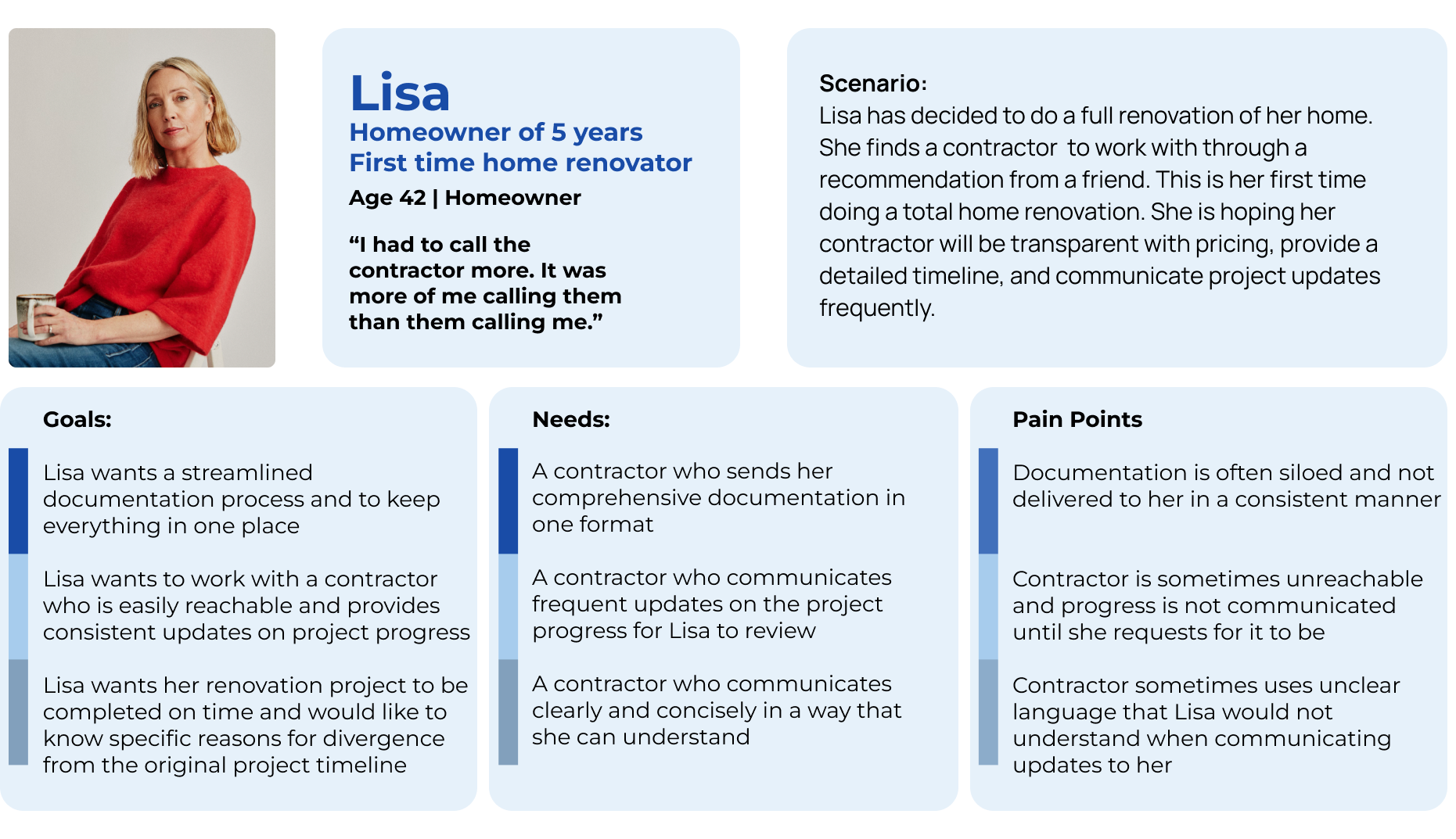
Persona
In synthesizing our research findings and understanding the needs, challenges, and goals of our target audience, we introduced a persona, Lisa, to encapsulate the BuilderComs’ typical user.
Lisa represents individuals undertaking extensive home renovations, desiring clear communication between her and her contractors throughout the process.
By personifying our target audience as Lisa, we maintain focus during the design process, ensuring our solutions align closely with the needs of our users and avoiding self-referential design tendencies.
Lisa’s Journey Map
Here are some opportunities we looked into
One platform to communicate with contractors and subcontractors
A timeline of what work needs to be completed
A way to keep documents in one place
Existing App Evaluation
Heuristic Evaluation
In conducting our Heuristic Evaluation, we identified areas of improvement throughout the application that would otherwise have been highlighted in usability testing. We then made changes to the application’s prototype that addressed problem areas uncovered in our Evaluation, allowing us to focus our testing efforts on substantive design changes and new features.


Test profiles shouldn’t be visible to user
Inconsistent contractor images
Page isn’t always responsive to users when scrolling
Credibility

Usability
Past messages slide out of users view when typing a message
Users wouldn’t remember recent messages if the info is hidden
Design Studio
As we dove into the design process, we gathered in our design studio for some rapid brainstorming. With everyone pitching in ideas based off of our research, we quickly sketched out key features. To keep things focused, we used a prioritization matrix and the Must/Should/Could/Won’t framework to sift through our many ideas and narrow down to the essentials.
This approach allowed us to quickly visualize different aspects of the features and combine the best parts of each idea to refine our redesign.

Prioritized Features
Home
User Profile
Contractor Contact Details
Push Notifications
Progress Timeline
Search/Filter Contractor
Document Storage
Automated Messages
Saved contractor list
Usability Testing
Existing Design » Proposed Design
In order to see if our product was helpful to users, we went through three rounds of usability testing, with a total of 15 users. We gathered feedback on the current state of the app, and made revisions to address problem areas for our proposed design. Between each test, we focused on the issues that were blocking users from completing the task directly.

Task #1 Get details from the Project Page


Users felt like they should be able to click on the entire card, not just the “View Project Details” button.

Users were confused by the meaning of existing icons (ex: eye icon)


The dashboard/homepage got a complete remake-over, while still keeping the “card” look of each project.

Clicking into the project will take the user directly to the project details, which will also show the feed and progress of the project.
In testing with out proposed design, usability tests showed an increase on average time on task and easiness rating, as well as a very large increase in success rate.


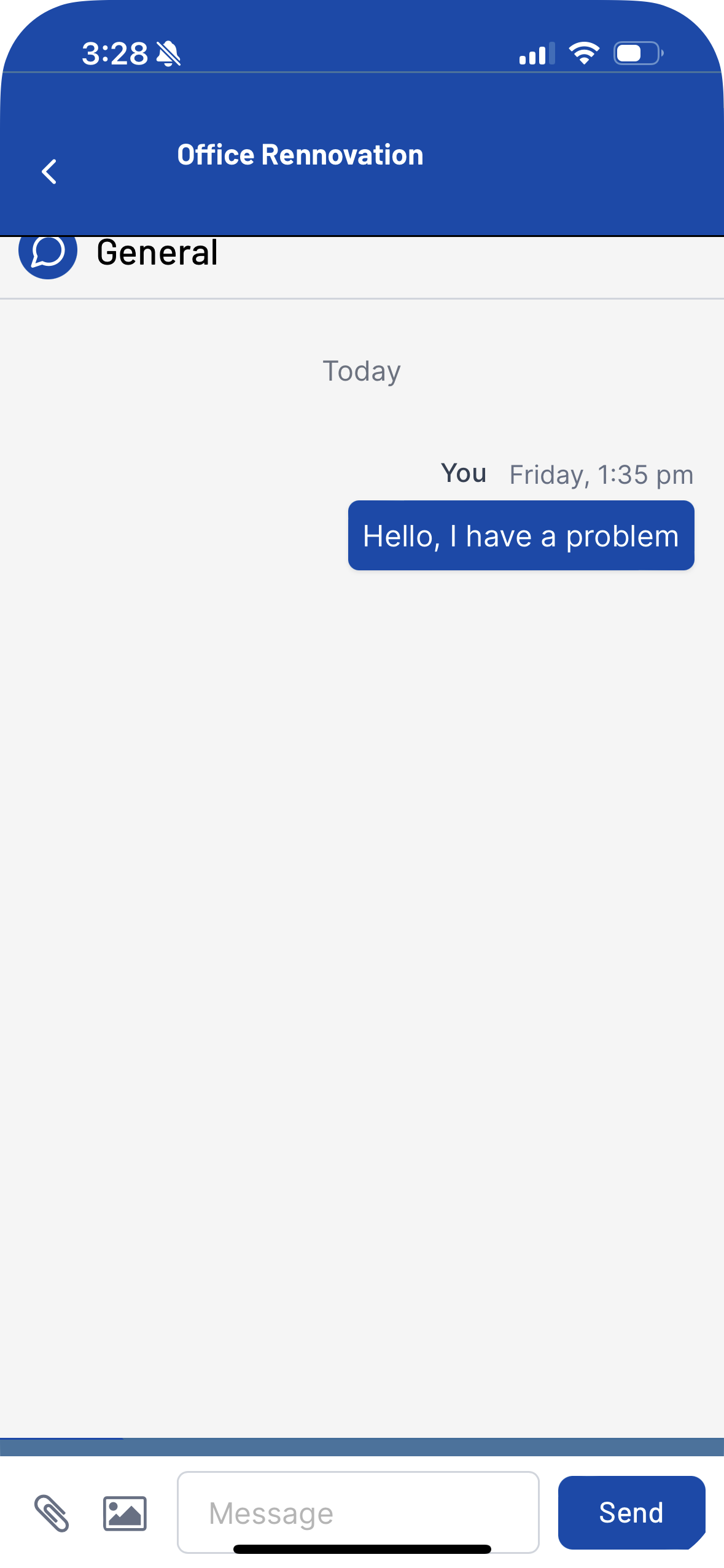
Task #2 Messaging your contractor
User presented with 4 different chats to reach the person that they need, which can cause confusion for the end user. They didn’t know which message category to choose and were confused by the various labels (general, sales, scheduling, service), which led to the high fail rate.
In the inbox of messages, there’s no border for the message of the sender. It just seems like one screen.
The chat would go under the header, and the bottom message box is too low.
Messages would slide up away from users view when typing a message. Users would not be able to remember the recent few messages if the information is hidden.


During usability testing, with the proposed design, the increase in time on task as well as the success rate was significant when compared to the existing design.
Having the different channels were important to With the changes we’ve made we’ve separated the channels into a default chat, to make the messaging method more familiar and in line with UI standards.


Task #3 Accessing sent document files
There are no exits when accessing an attachment.
Users were still unsure and hesitant when being taken to the chat screen on which channel to click.


We designed a page to view attachments, as well as a page for files to be stored and archived.
When clicking messages, users will be taken to the “General” chat by default, prompting them to explore the other channels when finding that there wasn’t an invoice sent to them there. Sales was the next button that they clicked.


Introducing the new BuilderComs app!
Take a look at some of the major updates we made to improve the user experience for homeowners and their communication with their contractors!

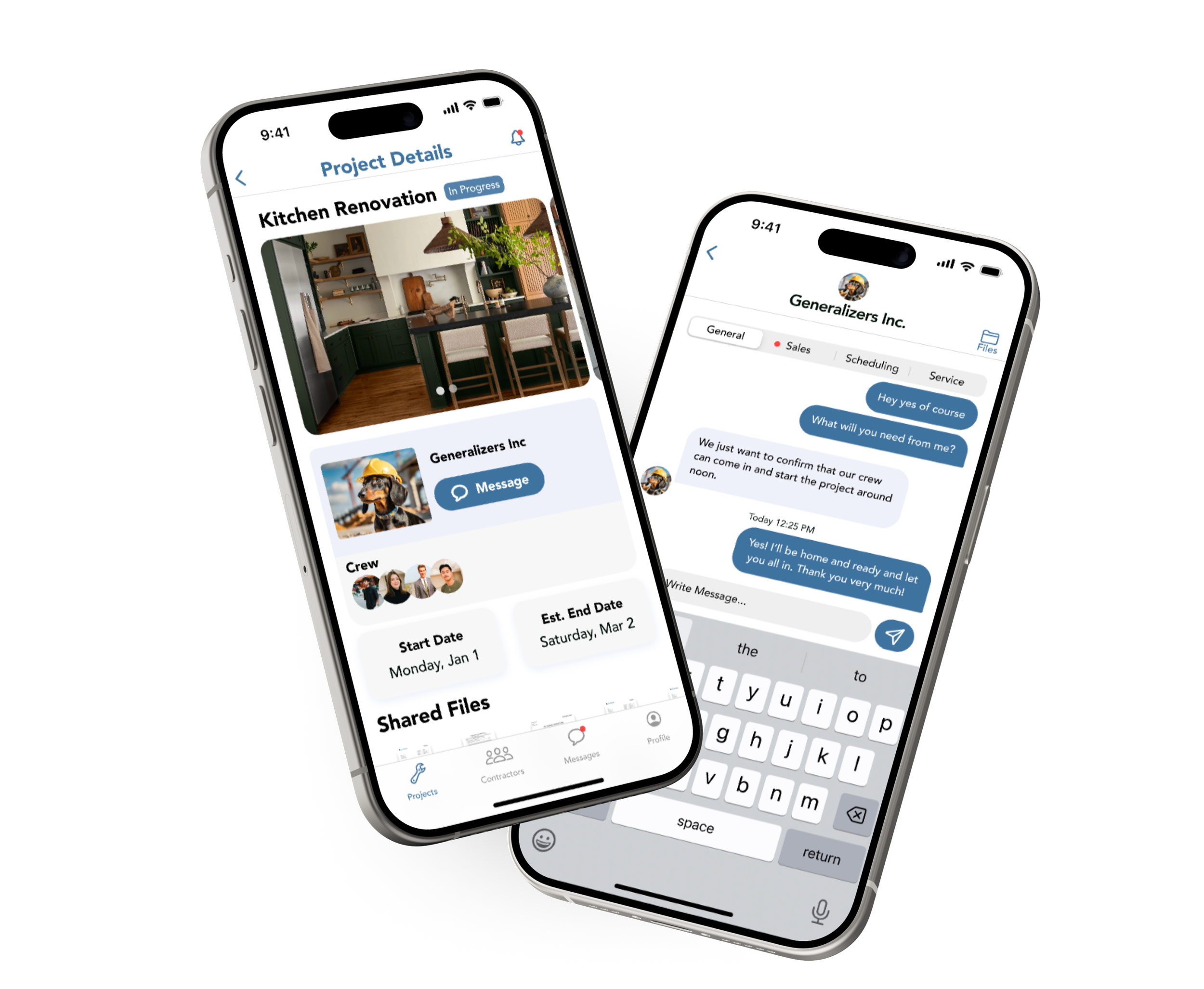
Homepage to Project details
From the Projects (Home) Page, users will be see on going projects separated into different cards to click on. Once clicking on the project, they will be taken to the project details page where they can view start date and estimated end date of their project. Additionally, users will be able to track the progress of the project as it goes.
Homepage to Project details

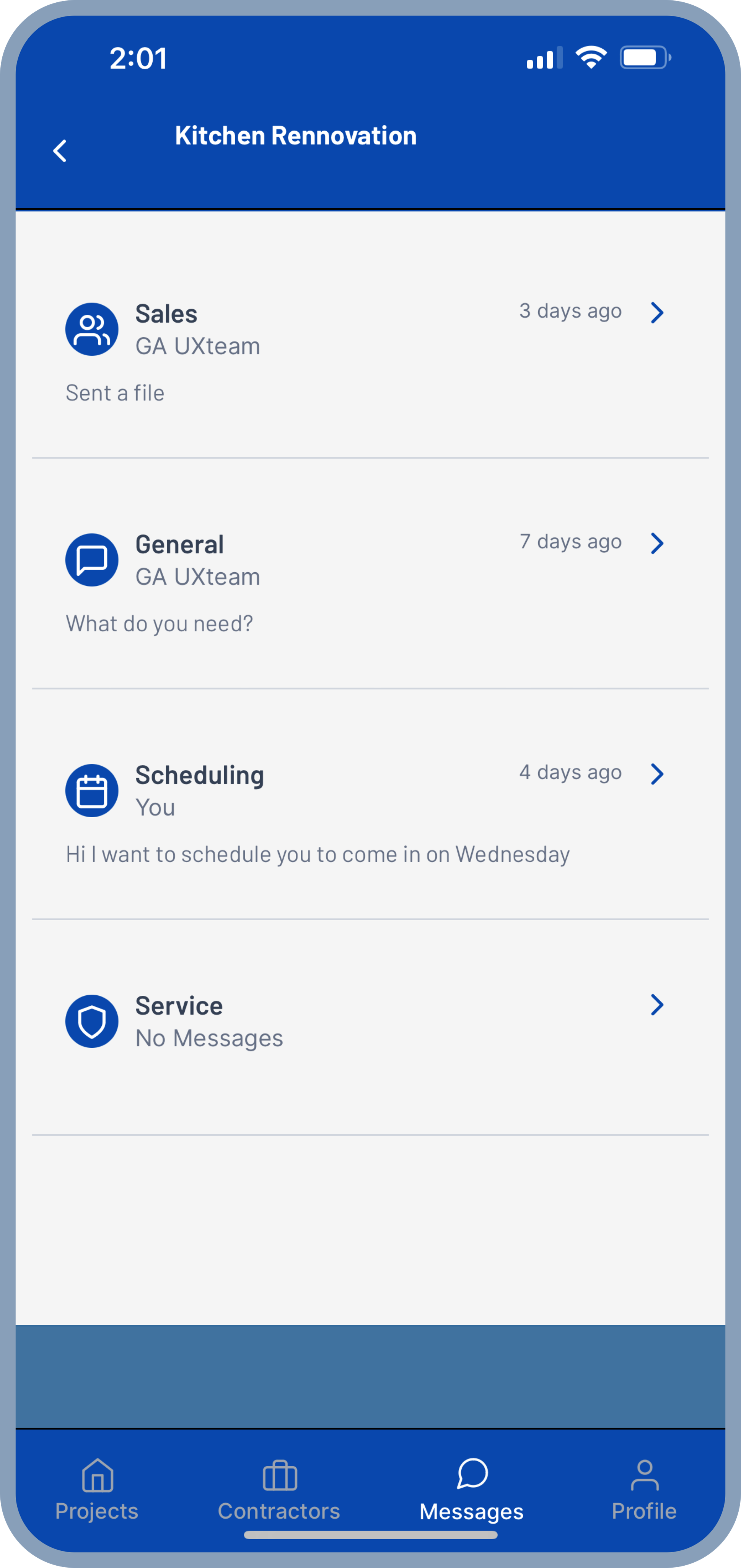
Sending messages with the proposed redesign tested more successful than the existing design. It’s UI is more familiar, intuitive, and smooth. Users will be defaulted to the general chat with their contractor, with the choice to switch in-between channels between: General, Sales, Scheduling, & Service.
Viewing an attachment


Users can view attachments sent by their contractor within their message inbox, or in the project details page. This way, homeowners can keep track of their records and receipts during the project.
Finding a contractor near you

Users will have the ability to search for contractors in their location and filter the type of work they need. The redesign will prioritize showing users the most relevant contractors, while also ensuring that brand logos are displayed uniformly to prevent cropping in the original photo.
Next steps for BuilderComs
We recommend to roll out features in segments rather than all at once. Having an incremental release allows BuilderComs to stay organized by minimizing risk. This makes it easier to identify any bugs, should any arise. During these phases BuilderComs can collect any user feedback while also allowing users to acclimate to the changes. These are recommendations, but feel free to make changes to meet BuilderComs needs.
Phase 1 Add segmented chat to current design Start working on proposed UI design
Phase 2 Add contractor sorting within the current design Continue working on proposed UI design
Phase 3 Roll out proposed UI Design Restructure Projects
Phase 4 Implement document sorting
